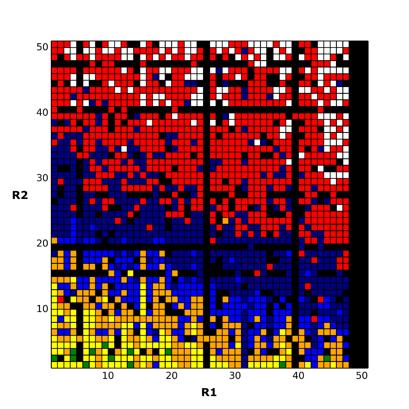
There is a nice dataset in the supporting information for Pickett et al. that illustrates how the sort order of rows and columns in an activity heatmap can hinder/help the identification of gaps which should be filled.
First of all, here is the heatmap in question, a 50×50 array. It show activity values for a series of analogs with the same scaffold but 50 different R groups at R1 and R2. Black squares are gaps where activity information isn’t available, white squares indicate inactive molecules, while the remaining colours indicate levels of activity from highly active (green) to lowly active (red).
The heatmap is depicted as shown in Figure 3 (top) in the paper where the rows (and separately the columns) are sorted by the most active molecule in the row. This has the effect of clustering the green squares in the bottom left of the array, and would suggest that the molecules in grid positions (2, 1) and (4, 1) should be tested next.
However, I would suggest trying (11, 2) and (20, 2) instead, and would say that in particular the molecule corresponding to (4, 1) is very unlikely to be worthwhile pursuing.
How so? Well, each row (and separately each column) can be considered a matched series; that is, the entire molecule is unchanged apart from a single R group. With this in mind, the sort order of the 2D array should be based on properties of these series rather than of any individual molecules in them, and especially not the extreme value which is unlikely to be representative of the row/column as a whole, and may indeed be a fluctuation due to experimental error.
A simple way to do this is to choose that row (and separately that column) with the largest number of filled boxes, and measure the average relative shift (that is, get the average deviation) of each row to it. If the sort order is based on this shift, the following heatmap is obtained: This image has a much clearer band structure. The two gaps at (2, 2) and (5, 2) are much better candidates than those inferred from the original heatmap. In particular, the gap at (4, 1) in the original is now at (44, 3) and can be seen, in context, to be a poor choice despite the green box in the same column.
If you are interested in more information on tools for SAR transfer, get in touch…

